

**Be warned! This post is going to be long and picture heavy! But I wanted to be thorough and to give you all the information, details, and tips I could squeeze in. I hope you don't mind! :)
So when we left off yesterday, I had my OhLife printout, my ephemera, and my photos all tucked away in a folder labeled with the week's number and dates. To start putting together my layout, I grab that folder and head to my workspace.
The first thing I do is choose the papers I plan to use and the color scheme for the week. I like to work with kits or single collections as my starting point. I find that if I'm left to choose papers from my entire stash, I quickly become overwhelmed, and I end up spending all of my time sorting through papers instead getting my layout finished. For this week, I chose the Dear Lizzy Lucky Charm mini kit from the Kinship Genealogy Etsy shop that, for some reason, I hadn't used in my Project Life yet - major oversight, since it's one of my absolute favorites!
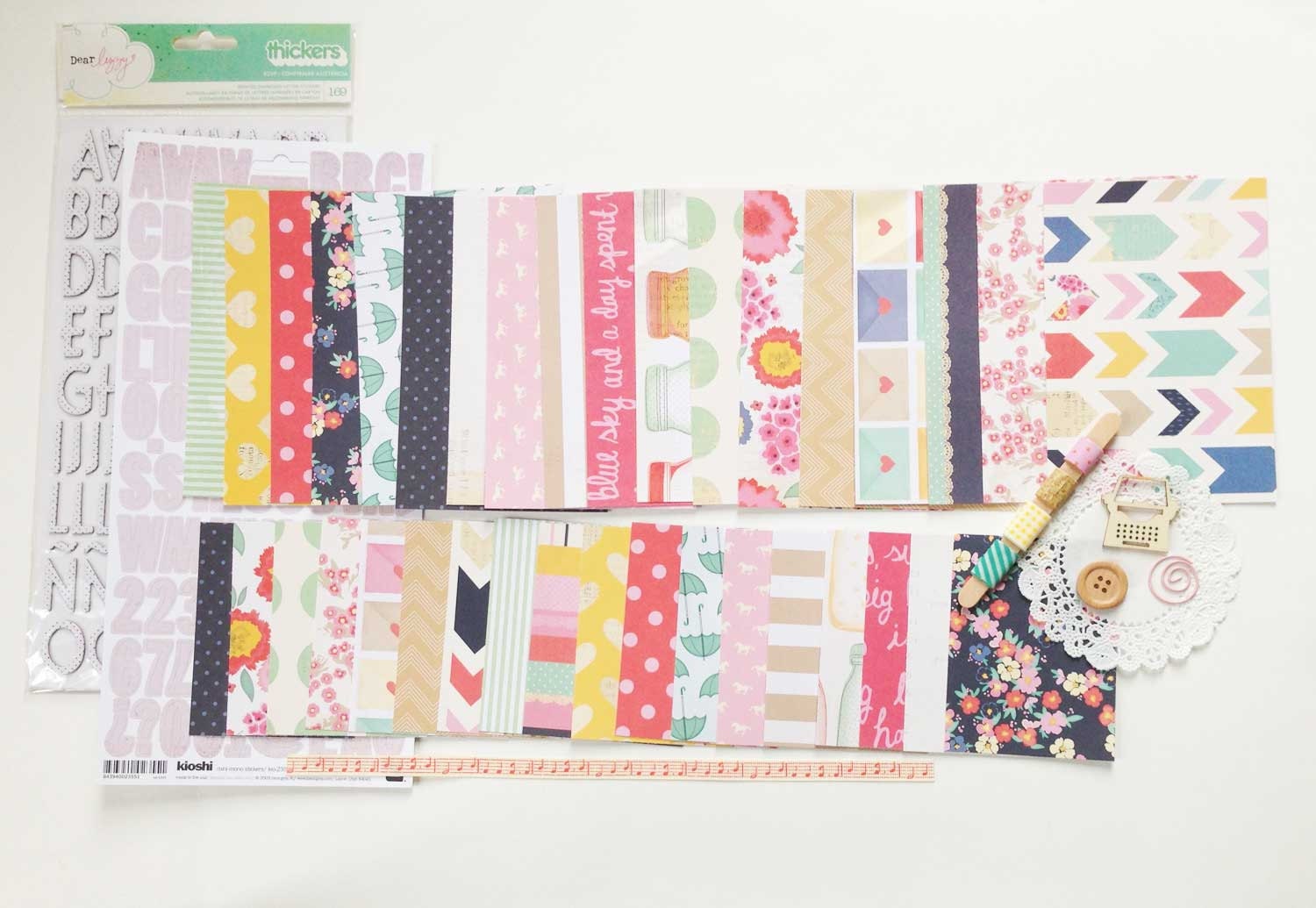
Gorgeous, right? I love this collection! So like I said before, I use the kits as my starting point, then add in a few extras that I think go well with the color scheme or theme. For this kit, I began by adding a few other bits from the Lucky Charm collection that I had in my stash...an obvious choice.

From there I grabbed the Albums Made Easy, Simply Happy 4x6 and 3x4 journal card sets from We R Memory Keepers. I had already used these in my spread for week 1, but there were plenty sheets left in each pad, and the colors coordinate beautifully with the Lucky Charm collection.

See how well they go together?! So perfect. Next I grabbed a couple (partial) sheets of the Love You More collection from Elle's Studio. I knew the colors would work well, and I was inspired by this spread by Adrienne Alvis to use the Doily Love sheet for my title card.

Finally I grabbed a few more pieces from previous Dear Lizzy collections that I though might work well. The colors from all of her collections are fairly similar, and while they may not all work together, there are bits from each that certainly do.

With my papers (and a few embellishments) chosen, it was time to start working with my layout. I grabbed two page protectors from my binder and laid them out on my workspace.


With my pages laid out, the first thing I do is start placing my photos where I think I might want them. I pay attention to size and color to try to create balance on my page. I also try to keep things somewhat chronological, but I'm totally okay with mixing up the order if it makes for a more aesthetically pleasing layout.

With my photos in place, I add in my ephemera. This week there were just two little bits to add. Some weeks I have to do some serious editing due to lack of space. I'm kind of a hoarder when it come to this stuff, so I often have more than I can deal with. Then I have to remind myself that it's not necessary to capture absolutely every detail of our week and that an overview will suffice (#thecrazyinmyhead).

With everything laid out roughly where I think it will go, I start adding paper and filler cards. Back at the beginning of this process when I'm picking out papers, there are usually several that I know I'll want to use in certain spots (like the Doily Love paper as my title card). I start with those.

Then I gradually add other papers that will work with the journaling I have planned and the color balance of the page. I try to make sure that the colors I use appear on both sides of my spread. For example, the yellow ombre paper I chose to use in the top right pocket, meant I needed some yellow on the left side. To make that work, I moved the iPhone screenshot of the weather to the left and added the yellow filler card in its place. This also worked to balance out the chalkboard background I used between the two ephemera pockets. The teal card on the bottom right balances the title card, the kraft card on the bottom right balances the Starbucks sleeves, so on and so forth.

Once I have background papers and filler cards for all of the pockets, I start adding some of the embellishments I think I might want to use. This is the point where I sometimes have to go back to my stash to find the perfect piece for a particular spot. I lay everything loosely where I think it might work before I adhere anything.

Once I'm satisfied with most of the pockets, I slide the whole thing off to the side and begin pulling individual cards in front of me to glue everything down and add the embellishments. There's usually a lot of fussing and fidgeting with each card as I attempt to get it just the way I want it.

For this spread, I planned to do quite a bit of journaling, and since I had a lot of information that I wanted to include, I knew my best option was to type it rather than hand-write everything. This would have been the perfect time to use that typewriter I've been searching for...but alas, I have not yet found my love...so my printer had to do.

With the typing and most of the embellishing done, I had an almost-completed layout. All that was left was to stitch things down using my sewing machine and to add some hand-written bits and stamps. And here's the finished spread!

I added a few stamped arrows and chevrons to fill in some blank spaces, and made liberal use of my date stamps. I also added my handwriting on the "breakfast of champions" card and some doodling on the "his & hers" card (I was going for a chalkboard effect).


I hope you enjoyed learning more about my process, and I hope it inspired you in some small way. Please let me know if you have any questions about any part of what I've written, and I'll do my best to provide answers here on the blog.

I'd also love to hear about your process, so please post links in the comments if you've written about how you complete a Project Life spread. There is always more to learn, & I find everyone's processes fascinating!

Thanks for stopping by!
Products Used:
Dear Lizzy Lucky Charm Document Life Mini Kit from Kinship Genealogy
Dear Lizzy Lucky Charm Lucky Coin 12x12 Paper
Dear Lizzy Lucky Charm This & That 12x12 Paper
Albums Made Easy Simply Happy 4x6 and 3x4 journal card sets from We R Memory Keepers
Elle's Studio Love you More Doily Love 12x12 Paper
Becky Higgins Project Life Design A Page Protectors
Glitz Design Color Me Happy 8x8 Paper Pad (no longer available)
Studio Calico Sundrifter Goodness Aqua Ombre Thickers
Amy Tangerine Goodness White Thickers (no longer available)
Amy Tangerine Yes, Please White Wish Foam Thickers
Hero Arts/Studio Calico Sundrifter Frame & Feathers Stamp Set (no longer available)
Project Life Date Stamp
Studio Calico Classic Calico 3 Roller Date Stamp
Uni Ball Signo White Gel Pen
Black Journaling Pen
Really helpful, and I must confess my building the pages of my life project is not so organized. But that will improve after your reading your way of doing things. Thanks!
ReplyDelete